COVID-19 forced the majority of brick-and-mortar businesses to transform their operations – and in some cases, their products and services – overnight.
With patrons stuck indoors and away from most recreational events for much of 2020 and 2021, it seems only natural that outdoor spaces have evolved to become a much-needed compromise and reprieve for consumers.
This increase in digital out-of-home (DOOH) potential has also given brands, agencies, and marketers a prime opportunity to connect with consumers in new ways accessible to businesses large and small.
In an OAAA recent report, 69% of surveyed people reported having an increased appreciation for their outdoor surroundings. Plus, it goes on to note that 45% noticed billboards and other OOH media more now than before the pandemic began.
There are so many out-of-home, outdoor options to choose from: static and mobile billboards, digital and interactive screens, augmented reality displays, street-lined lamp posts, bridges, transit advertising, and more.
Why is Outdoor Advertising So Effective?
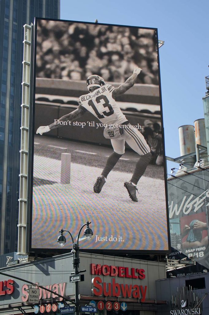
When executed well with the right content and location, outdoor ads can dramatically increase your business and build brand recognition with potential customers.
According to Technavio, the outdoor advertising market is poised to grow by $8.55 billion from 2020-2024 at a CAGR of almost 4%. In the United States alone, between 2019 and 2023, OOH advertising spending is predicted to grow by roughly $1.3 billion U.S. dollars, according to Statista. The top outdoor ad spending category in the U.S. was the “miscellaneous services and amusements” category, which spent nearly $2.02 billion U.S. dollars in 2019. Other categories among the top ten included retail, media and advertising, and restaurants.
Why the Investment in Outdoor Advertising?
Because it works. Far less invasive and imposing than the typical deluge of smartphone ads, outdoor ads invite you to participate without requiring you to skip an ad or close a popup. Look or don’t; enjoy the sensory experience or don’t. This is the advantage of outdoor advertising.
Digital outdoor ads are understandably even more powerful in their conversions and versatility. Recent research suggests that digital outdoor advertising contributes to almost 30% of OOH revenues worldwide.
Now you know it works. Let’s explore how to craft effective outdoor ads that will draw impressions and conversions.
How to Create Outdoor Advertising that Works
We’ve created a helpful guide for outdoor advertising that is broken down into 10 simple tips for optimizing your marketing campaigns outside. Hopefully, these give you some fun ideas to kickstart your conversions.
It’s all about location, location, location
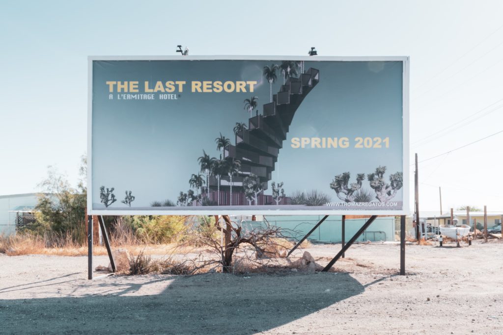
There is a reason that this tip is number one on the list. Where an ad is located determines how effective it will be. This goes for content, design, and creativity.
Before deciding what your ad is going to be, understand the impact your ad will have when combined with elements from the surrounding area. Consider driving or walking by the location from all directions to understand how your branding, colors, words, and context will land to users.
Some questions to consider?
- Is the ad visible from wherever viewers will be located – the street, the sidewalk, the bus shelter?
- Is the area free of obstructions that will block the ad?
- Will your font type and size be large enough to read?
- Are your color choices blending into the buildings or fields nearby, losing your message in the backdrop? What can you do to make it stand out?
- Is there local context that needs to be added to make this work even better for your brand?
Your goal is to aim for maximum exposure to your target audience. You want the most possible people to view and understand your ad in context.
Consider what you’re advertising. Is it best placed on a bus shelter where people might be commuting to and from locations, on a mobile billboard that drives by popular tourist destinations, on cartop screens atop rideshare vehicles, or other options? For example, an ad for a local lunch spot could choose to display lunch specials on Uber cars driving through popular business neighborhoods between 12 pm and 2 pm.
In outdoor advertising, size matters
According to a recent United States Sign Council (USSC) study, a person driving 45 MPH in moderately busy traffic on a four-lane highway sees a sign and reacts in 1.5 to 3 seconds.
What does this mean in terms of your outdoor ads? That they need to be visible and make a fast impression.
If your sign is large, then people will be likely to see it. However, bigger does not always mean better. If the message is too messy, long, or convoluted to read, your giant sign will not garner the kind of attention you’re seeking.
The ad as a whole should be large enough to read but must communicate the words clearly in a way that people can actually understand.
Give viewers content they can actually read
Avoid the temptation of adding too much flair to your font. Fancy, scripted fonts might read more high-fashion or couture, but on an outdoor ad, that’s not the primary goal. If that is your focus, you will lose the attention of viewers very quickly.
Think about the distance involved in your outdoor ad – driving or walking distance will affect the readability of a sign. Pedestrians casually walking by a bus shelter ad should be able to throw a quick glance and gather meaning without a second thought. Because you don’t have more time than that.
If your fancy or ill-sized font is too difficult to read, those potential customers will just stroll right on by.
In general, keep in mind the following tips:
- Font should be easily legible to all age groups; consider driving and walking by your ad from all angles and directions to consider all optimization.
- For your actual ad copy, this means factoring in 1 inch of letter height for every 10 feet of viewing distance.
- Use mixed-case letters instead of all caps; it is harder for the human eye to differentiate between lettering all in caps, as it all maintains the same silhouette in size and shape.
Keep it short and simple
It’s hard to pique the interest of people in a few seconds as they drive by at 45 MPH. It does not give you a lot of time to establish your brand identity, land your elevator pitch, and make the sale. But it is possible.
With average viewable bulletin time coming in around 7 seconds, each word and design element counts more than ever. Try to limit your campaign to 9 words or fewer. Aim for headlines of 3 words or fewer.
Be direct and get to the point quickly. You don’t have time to waste.
In terms of content, consider the function of the sign as much as the form. If a read-only sign is displayed for pedestrians, it provides a better, longer opportunity to be a little more nuanced and clever. However, for busy commuters, nuanced might be the wrong choice. Drivers have less time to think in context as they are focused on the road.
More is less with billboards and large outdoor signs.
Keeping the message clear and simple ensures that it’s more accessible to a larger audience. The response will be much stronger if people know exactly what you are saying to them. Stick to one message for high-traffic situations and commit to that.
Pro tip: Avoid abbreviations. Studies show that abbreviations take far longer to read than the non-abbreviated rate of 250 milliseconds per word.
Empower your ads by providing context and brand identity
Beyond the physical space that can be incorporated into outdoor advertising, context is just as important with the content of ad campaigns. Is there more information needed to understand what you are saying in your ad space? Do I need more storyline to back it up?
Ads should be able to stand on their own, but make sure the copy and content is connected to your brand identity also. Countless, memorable ads come up as topics of conversation, but without the brand connection, the opportunity is lost.
For example, is your logo familiar to a wide scale audience or does it need visual assistance to let viewers know what your company does? Often, advertisers use rhymes, alliteration, and repetition in content as it’s easier for people to recall them at a later date.
If convenient, don’t be afraid to tout your business by adding a powerful customer review or testimonial, a distinguished company award, or other noteworthy achievements that might set your brand apart from the competition. But do this in a way that is clear, clean, and to the point.
Make it matter to your customers
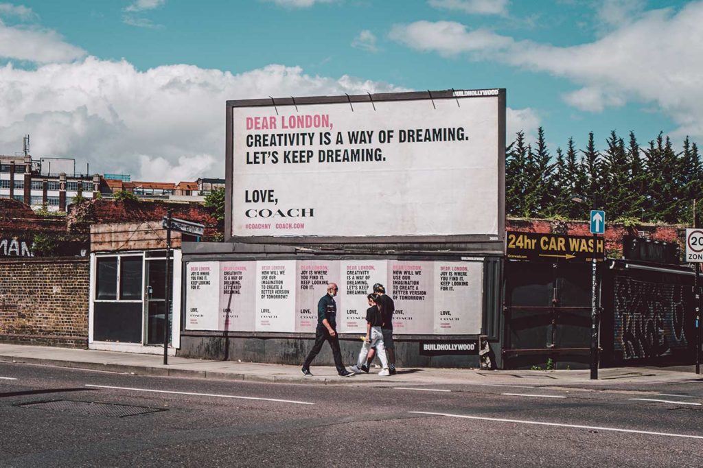
Consider your target audience when designing the content of your campaigns. The most important thing to customers is their needs. Why does your product, service, and brand matter to them? Is this clearly conveyed in your ad content? Who is your would-be customer? Is your product filling a need, providing happiness, or improving a common problem?
Ultimately, the first time customers try on a product is in their heads. Have you given them all of the tools to do this? Give them the ability to visualize themselves with your product. What qualities are they going to possess? What will this do for them?
Giving consumers the ability to picture themselves using your products increases the chances that they will then buy them. Don’t be afraid to use the second person, “you,” as it connects viewers more directly with what you’re selling. Even Apple employs this strategy with their marketing.
Pro tip: You can create a more powerful experience for viewers when adding an emotional connection for viewers into your ad content. Studies have found that advertisements with a strong emotional message are remembered twice as often as those with humor or promotions.
Engage audiences with eye-catching, colorful visuals
While it might seem natural to try to make your ad campaign as colorful as possible, more is not always necessarily better. It’s not about the amount of color you add but the contrast between your colors that pops and catches the eyes of motorists and pedestrians.
According to the Outdoor Advertising Association of America, “High color contrast can improve outdoor advertising recall by 38%.” Plus, make it a point to pick high-contrast colors (in hue and value) that are visible from larger distances – such as black on yellow or dark blue on white – as low-contrast colors will blend together, making the message hard to read. However, as stated earlier, don’t forget to keep in mind the backdrop for your signs, as a yellow background on a yellow building won’t have the same impact as on a grey one. Some brands even add glow-in-the-dark paint to their signs.
The amount of free or “white space” you leave on your ads also matters; maintain 30% to 40% of your sign’s area as bare to improve readability and avoid design clutter.
Bonus Tip: Many space providers allow you to add three-dimensional depth to your campaigns to attract attention from even further away. With extensions available in inflatable, molds, steel, wood, foam, and fiberglass, it’s easy to imagine the creative ways that depth can be layered onto ads.
Plus, when it’s visually striking – like a fake snowboarder levitating above a billboard ad for outdoor sports – it can quickly become a memorable story or experience that users want to share on social media. Going viral could certainly help increase your brand recognition and conversion rate.
Transform your campaigns with digital outdoor advertising
In terms of design, all of the above applies to digital. The content, colors, and strategy should all be creative to draw in potential customers.
But digital outdoor advertising takes it a step further.
Adding LED sign technology to the mix is actually affordable, easy-to-use, and really effective. Plus, it offers brands the ability to update, pause, and optimize campaigns in real-time based on valuable insights based on consumer behavior and current trends.
Digital signage has been shown to increase brand awareness by 47.7%, average purchase amounts by 29.5%, and repeat purchases by 32.8%, according to Verizon Media.
Pairing the benefits of out-of-home advertising with the advances made possible via digital tech, brands can transform their campaigns from casting an indiscriminate net to using hyper localized targeting to create tailored experiences that are displayed only to the right segments of people.
Discover the Future of Outdoor Advertising
Outdoor advertising is an incredible way to improve brand exposure, create household familiarity with businesses, and increase ROI on marketing spend. Print and digital advertising provide a consistent way for advertisers, brands, and agencies to connect a diverse audience of drivers and commuters to engaging, relevant content that sells.
With ALFI, advertisers can easily snag prime ad spots from prime publishers, including a range of powerful, effective DOOH tools and channels. Create campaigns that are shown to thousands of people every day in cabs, Ubers, hotels, restaurants, and much more. Want to know more? Drop us a line and our team will get in touch with you!
